Sunday 18 March 2012

S H O O T P R O G R E S S

I have included two moodboards to help with the next two shoots taking place this week. The focus of my first shoot is the idea of growth taking over the face and body. To create this I will be using foam clay that I had previously experimented with in black, however for this particular shoot I have chosen to  use white as in my previous shoots I have kept the continuity of white I feel this will tie in well.


 The focus of my second shoot is the melting away of flesh and skin. Using a flesh coloured acrylic paint I will be dripping this down the neck with the face not visible to create the idea of the flesh melting away. I want to create the effect of wax as using real wax is not possible for health and safety reasons. My main concern with this shoot lies in regard to the creation of a layered effect with wet paint.


R E C A P

I now have five images edited ready for my book. I have in turn put the images together to examine the aesthetic quality of them as a collection. It is important that they show continuity throughout as well as representing and ensuring a futuristic theme remains constant. I have created various different concepts for every image, however I believe they also work well as a collection of images that develop an idea of adorning the face and body in a futuristic way.

Originally I planned to produce six to eight final images, however it was a this may also prove rather ambitious from an early stage. Despite this, the surprising progression of the project has led to the development of five images at this stage and therefore I will aim to develop 10-12 images. This will not only make for a stronger collection but will give me the opportunity to really experiment with the adornment of the face and body. I have many ideas that I want to follow up and take further as a concept, and therefore the decision to produce more imagery for the book will allow for this.

N E X T S T E P

I am now preparing for my next two shoots this week. As my studio space is limited I need to be completely prepared and organised in order to work to my time limit. This week I will be focusing on the use of magazine printing onto the legs. As you can see from my moodboard below, I have used examples of patterned tights and painting onto the legs. I want to take this idea further by printing fashion/editorial images onto the skin using magazines. The way we see images in the media is through magazines/newspapers and internet  and therefore I want to push this boundary by the idea of wearing the media on our skin. Perhaps this is the future of advertising? 

My second shoot looks at the use of the spine. I am using a soft material and looking at the curving of the spine in relation to evolution. I bought 8 shoulder pads, with a mixture of sizes so i am able to alter the size as it goes further down the back. I want to capture the movement of the spine.

Please see below for my two moodboards for the two shoots taking place tomorrow.


I have completed my shoot today and preparation has ensured that I was able to complete both shoots in the time given. I am pleased with the outcome and I feel I have portrayed the concept well in my images. Please see below some unedited images from today's shoot. All of these images capture the movement of time however some are slightly overexposed and others may draw concentration away from the intended concept. 


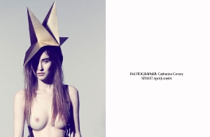
I have chosen one image from each of my shoots. I am happy with my choices and feel these show the adorning body well. Please see below for my two chosen images, both of which are ready to be published.


Photography, MUA and concept:
 Lauren Banner


Assistant:
 Allie Meek

V O G U E P A T T E R N S

The beautiful images below were featured in Vogue Italia in 2007. I love the flamboyant use of colours combined with a clash of patterns in developing a glamorous yet startling effect . It was around this time that the tattoo sleeve had became very popular. The models featured included the likes of Lara Stone, Meghan Collison, Kinga Rajzak, Maryna Linchuk and Hanne-Gaby Odiele. Photography: Steven Meise.


M O O D B O A R D

My next two shoots will primarily focus upon the body and adorning the shapes, as well as the way we look at the body. I will be creating these two shoots within one allocated studio time. 

My first shoot will specifically focus upon the spine. I will be looking at the shape of the spine and how this could both evolve and adapt.  I want to create this look with a soft material, a contrasting one rather than that usually associated with the spine. To achieve this specific design I will use shoulder pads.

The second shoot will study the legs and their use in a futuristic world. The common use and look of tights will adapted to achieve this futuristic design. To achieve this I will be using magazine images and nail varnish remover to transfer specific images onto the legs of the model.


Wednesday 14 March 2012

S E C O N D S H O O T

My shoot today went as well as I had hoped. I was able to fit in three different shoots within the allocated time, however my third shoot proved rather disappointing in reflection. Below I have attached my chosen two images intended for the final book. I love the way the top image almost looks like a piece of modern architecture upon the models head. It is the smooth textures I feel that have helped create this specific look. The second image creates a half-skin, half-plastic texture, a representative of ever developing and emerging technology.


Photography, MUA and concept: Lauren Banner


Assistant:
Allie Meek


I have attached a few images from the shoot I didn't feel were successful enough to be included in the final book. However I do feel it important to document this in order to improve upon in the future.


In the first image I wound wire around the face and I don't feel this was tight enough to create the desired effect. I do plan to re-shoot this image as I like the concept and its intended effect, despite it not being achieved successfully on this occasion.  However I do like the second image but again the lines made by the wire are strong nor clear enough to justify its inclusion in the book.

P R E S E N T A T I O N A N D M O O D B O A R D S

Today I had a small group presentation with Chris that gave everyone a chance to showcase the progression of your project and your intentions with the rest of the project. I felt overall that my presentation went well and in turn the feedback I received was positive. Chris liked my choice of final image and the way I captured the movement. In the past my feedback has been hard to receive as I haven't been able to show much other than research images, experimentations and mood boards, so it was great to hear I am on the right track. It also became apparent  that in comparison with my mood boards the project was beginning to take shape and was on the right track. I will admit I have found it hard to start my project due to drastic changes in the beginning somewhat throwing my concept and original idea off track. Therefore it is great to feel back on track and I feel I have a new found confidence within my project.


A point that was made to all was that despite being on the right track, we all need a goal to work with and that it is important to work out who we are going to print with as well as when we will need to have everything ready for print. So taking this on board I have been looking at printers and have found a company called Mimeo (http://www.mimeo.co.uk/). I have been in contact with them and once I have a few more images I will be organising a test print. Whilst talking to Mimeo they did say there machinery was unable to print a perfect bound landscape book that opens at the side, however they could print so the bind was at the top. Mimeo have given me a few days to think this over and I will get back to them when I have worked out if this is in fact suitable for my project. The more I have considered this I believe it may in fact be quite effective and fit the overall concept well. 


 Please see below two of my moodboards that show the inspiration and makeup for my next two shoots which were also today. Although I had the studio space booked between 2-8pm I was only able to use the studio between 4.30 and 8pm due to my presentation time. However this proved to be enough time today, and overall I am pleased with my outcome. 


Monday 12 March 2012

P O N Y T A I L M A G A Z I N E


I thought I would include a selection of images that create a magical and powerful consciousness. Adorning the face and body in an ultramodern way. Images found on  http://www.ponytailmagazine.com/en/


Photography: Catherine Conroy
Make-up and Hair: Maaike Beijer for Mac at Angelique Hoorn Agency
Model: Marielle and Roos at Ulla Models
Digital: Alan Jensen
Stylist: April Jumelet

Sunday 11 March 2012

F U T U R I S T I C B E A U T Y


This video has a futuristic and beauty forward feel to it. The icy blue colours accentuate this futuristic theme. Although I found this video after my first shoot and have already developed this concept in my own way it has also helped me with future shoots and provided inspiration toward my remaining images..

P R O G R E S S

This week I have planned two photo shoots, Tuesday 13th March (5-8pm) and Thursday 15th March (5-8pm). Although with only a small amount of studio time I do plan to create two shoots per time slot leaving me with another four more images ready for my book. This will leave me with five images to create by the end of the week, including my image from my previous shoot. I have had plenty of time to collect the right materials for the next 4 four shoots and with plenty of time to research I feel prepared and organised for the week ahead. Another plus to creating 2 shoots per studio time is that if an image doesn't work I am leaving myself enough time to re-shoot.


This week the materials I will be using for my shoot will be wire, balloons, tights, magazines and cling film. All very different materials in texture, colour and style however each will hopefully compliment the other as a collection of images.


Please see below for some inspirational images I have collected throughout my research process. These images have helped inspire my ideas and further my designs, through their use of colours, textures and lighting.


C H O S E N I M A G E S

Below I have chosen to showcase two of my successful images. Neither image are complete in regard to post production but the intended idea and overall effect is apparent despite this. The two images are very different in style. The top image works well in concept depicting the ghostlike clone of the model, alienating it into the future. The bottom image however is successful in creating a perception ofpower and shows the adornment of the face in a stronger light. 


S H O O T O N E , P A P E R

YES! I created my first final look for my book today and I am delighted with the outcome. I finally feel asthough I have created an image that looks futuristic. With the illuminated complexion and the metallic lip mixing well with the white eye makeup I feel everything ties together very well. During the shoot I blended the cones into the skin with screenface moulding putty, and went over the putty with white to blend into the skin and cone. The main problem I had with this was that every time the model moved the putty on the neck detached itself from the skin leaving a gap (as you can see from the top image). After numerous attempts to re-stick the cones  it was apparent that unfortunately some of the images do show the gap. Therefore if I am to choose one of these I will have to blend it into the skin using photoshop, however I want to try to avoid this and the images appearing too re-touched. By avoiding over-editing I feel this will be an important step in representing the idea of adorning the body using materials as well as makeup, and not through post production.


I shot some simple images trying out a variety of styles and by positioning the camera from a range of angles. To compliment the frosty look I used a blue cellophane over the light on one side, thus creating a subtle yet effective shade of blue adding cold, futuristic elements to the image that developed a clearer concept. I also changed the exposure on the camera settings and began experimenting with movement, a look I had wanted to fashion from the beginning. This in turn achieved movement that softens the image without taking away any power.


Please see below a range of images from todays shoot, I have tried to include a variety to show the different effects created using both lighting and cellophane. Also included is a close up image to show the cones in detail. All of these images have not been re-touched.


Photographer, MUA and concept: Lauren Banner. 
Assistant: Allie Meek.

C H A N G E S MA D E

I have had to overcome a problem with my previous moodboard for tomorrows photoshoot. After showing Chris the moodboard I realised my makeup didn't really show anything new or futuristic, this was especially apparent when using a smokey eye. As well as picking up on the makeup, Chris also said the image I used was rather weak and as an image did work well. I have decided to use the previous moodboard as a guideline to remind me areas I should avoid with the project. I have made a few changes to my makeup and will be utilising white to a greater degree. This will create a mysterious frosty look, that also looks both beautiful and intriguing. I want to keep the makeup and hair simple and clean throughout, keeping the focus on the adorned face or body. This will also help keep a consistency throughout all the images ensuring the project flows as a whole.


I have found some inspiring images that create beautiful looks using white/metallic makeup.


Images taken from  http://models.com/feed/?p=6019 and http://billykidd.blogspot.co.uk/2010/08/linn-arvidsson-dna.html

F E E D B A C K

Today I had my first feedback with Chris since my test shoots. Although he was pleased that I was on the right track he didn't feel my images represented the idea of futurism and he questioned the use of string. Although agreeing with the points Chris made today I feel the specific shapes that the string made upon the face was a particularly powerful aspect and that the idea of experimenting with this concept came from a quick feedback last week with Jennifer. This has in turn created as sense of slight confusion. I think I will still try adapting the string further into my project, as with the correct makeup I feel it may still work.

My feedback overall seemed to question the use of materials. Although the materials I use are important I feel the point of my project is how I use them to represent my overall concept.


Tomorrow I have my first shoot that will be published in my book. Originally I was producing a look-book that would exhibit my unique face jewellery, however since development my project has altered. Despite this, although my target audience is still the same, appealing to a wide range of ages, keeping a sophisticated and clean look is still an imperative aspect to the project. I would like to see my book displayed on coffee tables in art and design based offices.


My first shoot will be created using white paper/card. I want to focus mainly on the face and neck in particular. Below is the designed moodboard for this particular look.


As you can see from the images used I want to create a slick side parting with the rest of the hair back and of the face asI don't want any focus taken away from the face. I have taken inspiration for the hair from the 1960's space age fashion I previously looked at. In regard to the makeup I want to create a nude lip, alongside a smokey eye thats in-keeping with my space and galaxy colour theme. With highlighted skin and a clear complexion I also want blocked out eyebrows creating an almost supernatural or alien like look. 


The main image of the moodboard is an image that has provided particular inspiration.

T E S T I N G , T E S T I N G

Today after I had shot a look for my portfolio I carried out a few test shots to further my experiments and ideas. Using the rest of my studio time to test shoot proved a good use of time and helped in the progression of both my portfolio project and my final major project.


My suitcase was full of string, cling film and colourful powders. Tying and pulling at string around the face and neck created different expressions on the face and the skin began to bulge out into the empty spaces. My model was unable to move her mouth and was restricted with head movements as I photographed. Removing the string from the facet created red lines due to its tightness, this was an interesting surprise and I didn't expect the string to make such a strong and bold effect on the skin. I threw blue, orange and a purple glitter over the face when the string was on, I wanted to see the effect left on the skin. I don't feel this look was very powerful but this was possibly due to the need for more string. 


I also tightly wrapped cling film around the face. This pulled parts of the face up and down and again changed the natural shape of the face in an interesting manner. I liked the way the cling film created a sense of claustrophobia. I am really pleased I test shot before hand as it has been an important step in my design development and has given me some more confidence in regard to the ideas of the project.

 Please note none of these images below have been re-touched.


Photographer, MUA and concept: Lauren Banner


Assistant:
Allie Meek